blog post format · Nov 17, 2026
Blog Post Format: Structure, Headlines and Template
A reader lands on a blog post from search, scans the headline and opening, and wants to know one thing: is this page going to answer the question? A strong blog post format makes the answer easy to find, then gives readers who stay the detail they need to act. Table of Contents. The Blog Post Format
A reader lands on a blog post from search, scans the headline and opening, and wants to know one thing: is this page going to answer the question? A strong blog post format makes the answer easy to find, then gives readers who stay the detail they need to act.
Table of Contents
The Blog Post Format at a Glance
A useful post has a simple shape: a clear headline, a direct answer near the top, sections that follow the reader's questions, evidence beside the claims it supports, and one next step at the end. The same structure works for a short update or a long guide. What changes is how much detail each part needs.
Element | What it does | Check before publishing |
|---|---|---|
Headline | Names the topic and the promise | A reader can say what they'll learn from the headline alone |
Answer block | Gives the direct answer in the opening | The answer fits in two or three sentences |
Body sections | Answers one sub-question each | Each H2 is descriptive and does one job |
Evidence and examples | Supports each claim | Every number has a named source |
Lists and tables | Makes steps and comparisons scannable | Use them only where readers follow steps or compare rows |
Next step | Tells the reader what to do | Give one clear action, not a menu of options |
Meta title and description | Frames the result in search | Both are short, unique, and match the answer block |
Image alt text and captions | Describes visuals for every reader | Alt text is specific and the caption adds information |
A practical long-form structure starts by defining one search intent, answering it in the opening, and using descriptive H2 and H3 headings to divide the body into sub-questions. That shape matches what Nielsen Norman Group's research on writing for the web found: most readers scan rather than read word by word, conclusions placed first save them time, and headings, bulleted lists, tables, highlighted keywords and one idea per paragraph make text easier to scan. Formatting supports clear writing; it can't rescue an article that buries its answer under bold text and bullets.
Take a post called “How to Start a Newsletter.” Its H2s might be “Pick a Platform,” “Write the First Issue,” “Grow the List,” and “Measure Results.” Those headings follow the reader's path from choosing a tool to evaluating whether the newsletter is working. Each section should answer its own question without making the reader hunt through unrelated background.
The first screen should tell a reader the answer, what the post covers, roughly how long it takes, the first step, and where to go next. For more practical guidance on organizing content around readers and search, see how to improve your posts for search.
Headlines and Openings That Earn the Click
A headline should tell readers what a page covers and why it's worth opening. “Our Thoughts on Blogging” gives no clear subject or payoff. “Blog Post Format: Structure, Headlines and Template” names the topic and signals the help readers can expect.
Google may generate a search-result title link from the HTML title element, headings, and other page elements. It recommends making titles unique, clear, concise, and accurate. Search snippets usually come from visible page content, though Google may sometimes use the meta description, which should be short, unique, and focused on the page's most relevant points, according to Google's SEO Starter Guide.
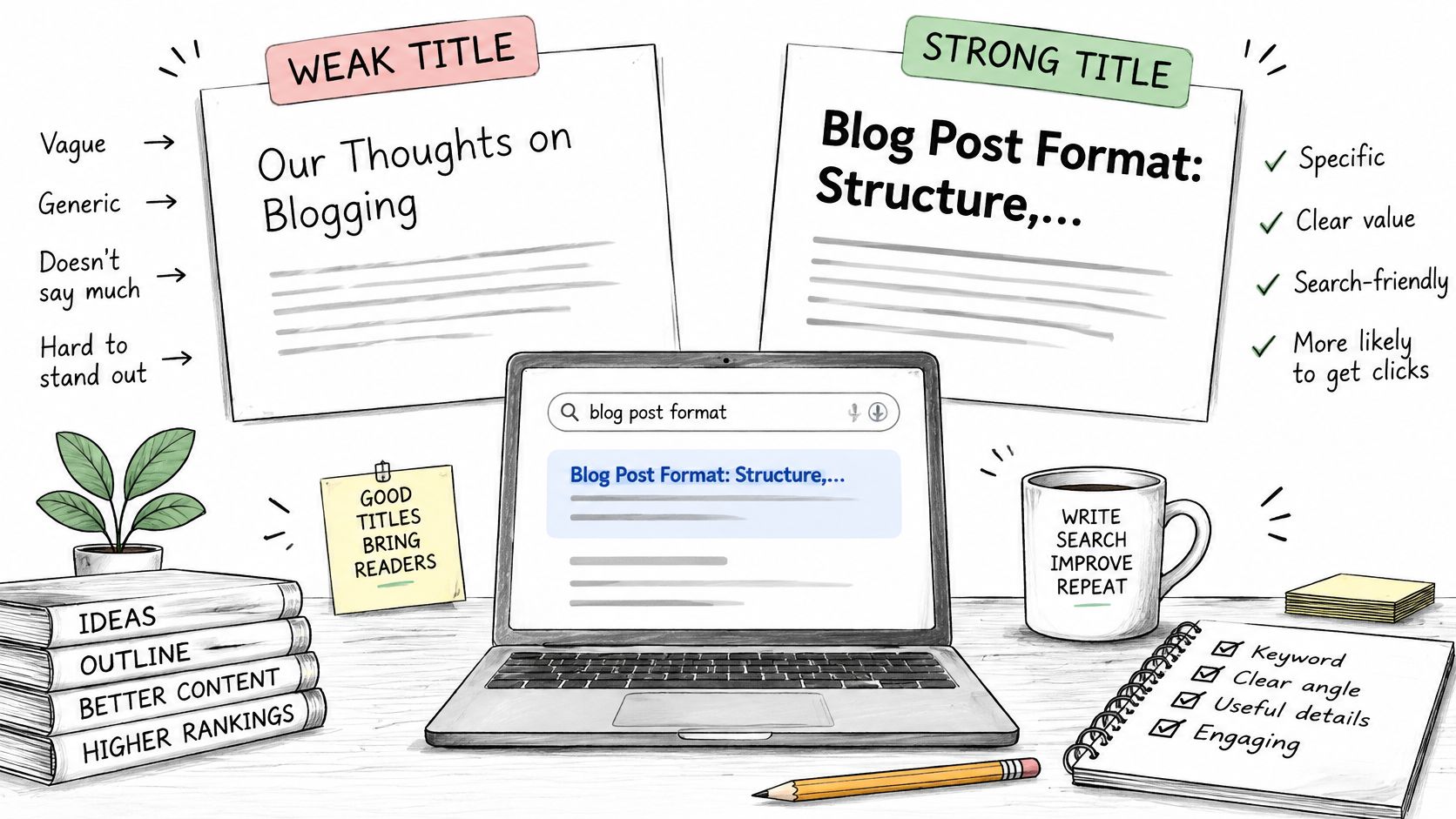
Two checks catch most headline problems:
Topic first: Put the main subject near the beginning so readers can identify it quickly.
Promise clear: A reader should be able to say what they'll learn from the title alone.
The opening has a similar job. It should answer the question in two or three plain sentences, then briefly say who the post is for and what it covers. That makes the page useful even when a search summary has already given the reader part of the answer.
Compare a vague opening such as “In today's fast-moving content world, blogging has become more important than ever” with a direct one: “A blog post format is a repeatable structure for presenting an answer, supporting detail, and a next step. This guide shows how to choose headings, length, and page elements for the reader's task.” The stronger version names the subject, reader benefit, and scope without warming up at the reader's expense.
Opening test: Read only the headline, meta description, and first paragraph. Can a reader tell what the page answers and what to do next?
Draft the meta description as a standalone summary of that answer, not as a teaser that promises more than the post delivers. Editors looking for more ideas on shaping readable openings can also consult these practical blog writing tips for 2026 and this guide to why a blog introduction matters.
Length and Heading Structure for Each Post Type
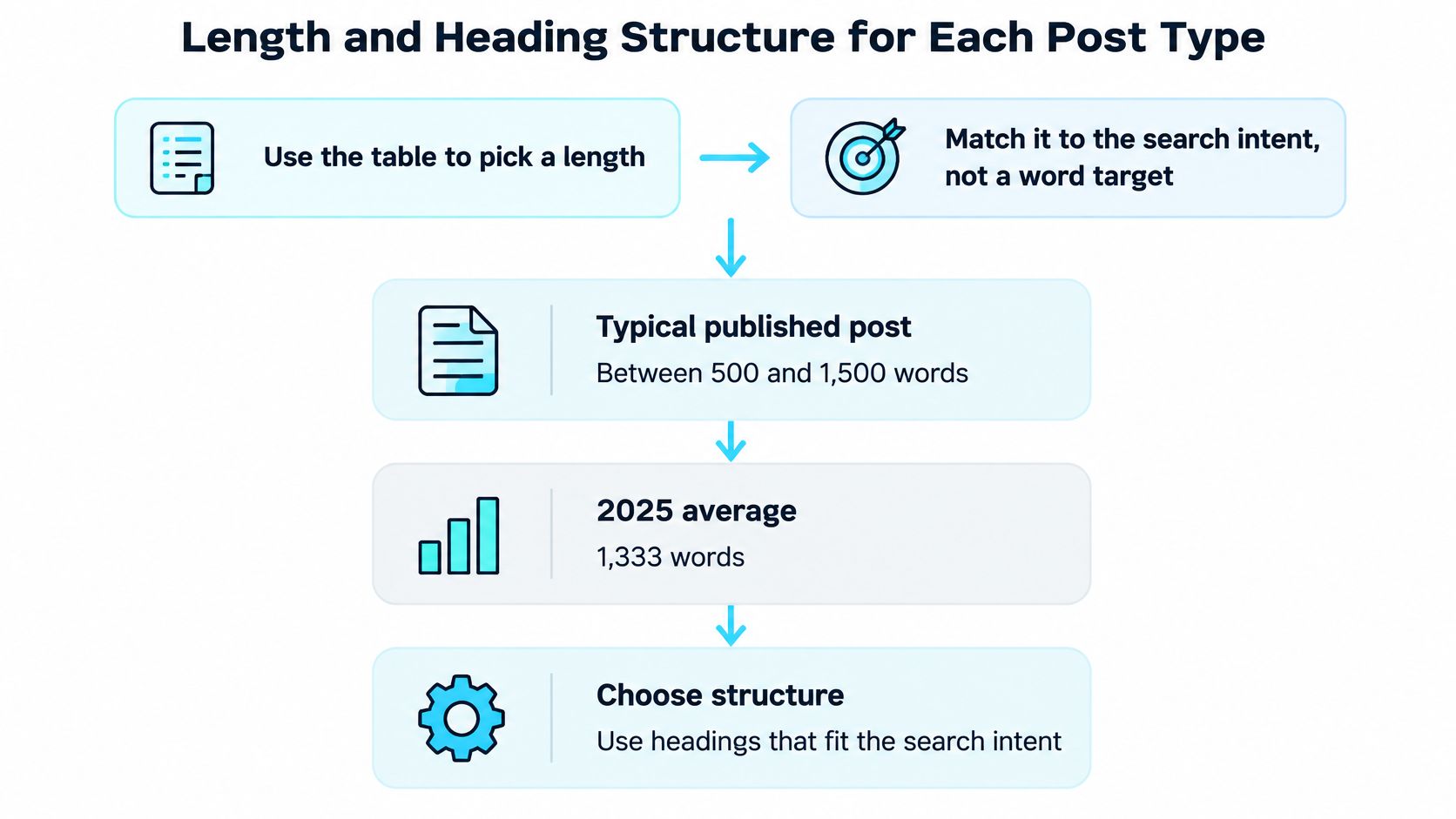
Word count should follow the question, not a target chosen before the outline. Orbit Media's annual blogger survey found that average post length rose from 808 words in 2014 to a peak of 1,427 words in 2023, an increase of about 77%, before easing to 1,333 words in 2025. In the 2025 survey, 64% of bloggers published posts in the 500-to-1,500-word range, according to the Orbit Media blogging statistics summary.
Post type | Word range | Best for | Benchmark |
|---|---|---|---|
Typical published post | 500–1,500 words | Explainers, updates, and most how-tos | Most bloggers publish in this range |
Average post in 2025 | 1,333 words | A standard guide with examples | Orbit Media's 2025 survey of 808 content marketers |
Long-form guide | 2,000+ words | Evergreen references with examples and comparisons | Rare; reserve for topics that need the depth |
The average blog post length in Orbit Media's 2025 survey of 808 content marketers was 1,333 words, as reported in its 2025 blogging benchmarks. That figure is a useful benchmark for planning a standard guide, not a rule that every post should hit. A longer guide earns its length when the reader needs more steps, comparisons, examples, or evidence to make a decision.
Use one H1 for the page headline, an H2 for each main sub-question, and an H3 only when a genuine step or sub-point belongs under an H2. A 1,500-word how-to might use five H2s of roughly 250 to 300 words each, with an H3 only where a section contains a distinct procedure. Keep paragraphs focused, usually two to four sentences, and leave enough space between them for the page to scan comfortably.
Scope rule: Start with the minimum coverage needed to satisfy the search intent. Add detail only when it removes reader doubt, and update the post when its facts or procedures change.
Padding a short answer to reach a word count wastes the reader's time. Cutting a guide so aggressively that it skips a required step is just as unhelpful. If a section can be removed without leaving an important question unanswered, remove it. For practical guidance on hierarchy, see this advice on SEO header tags from Riff Analytics, or this walkthrough of formatting long-form content for readability.
Lists, Quotes, Tables and Images in the Body
Choose each content block according to the reader's task. How-to posts are a common blog format, and list posts are widely used too. That makes sense: steps guide readers through a process, while lists make separate points easy to scan. A useful post format lets the main answer stand on its own for skimmers and search summaries, then gives readers who stay the detail they need.
Use numbered steps when order matters. A newsletter-starting guide might move from choosing a platform to drafting an issue, collecting sign-ups, and checking performance. Give each step one action, then explain why it matters. If the actions can happen in any order, use bullets instead of suggesting a sequence.
A comparison table helps readers judge options against the same criteria. For a newsletter-platform comparison, columns might cover pricing, audience tools, and export options, with a row for each platform. Base factual cells on the platform's published information, and include dates when prices or terms may change. Keep each cell focused. Long explanations, nested lists, and unrelated claims make tables difficult to scan, so move that material into prose.
Keep other blocks equally purposeful:
Bullets: Use them for a short set of tips, requirements, or common mistakes without a meaningful order.
Blockquotes: Highlight one key takeaway when it deserves emphasis. Explain the point in the body rather than making the quote do that work.
Callouts: Flag a warning readers should not miss, such as an eligibility condition or legal requirement.
Images and charts: Include them when they clarify a process, comparison, or finding that would be harder to understand in text alone.
Captions should add context, not repeat the paragraph beside the image. Describe informative images in alt text; decorative images do not need a written description. Original research can help a post stand out and attract external links, but producing it takes more work than reorganizing familiar advice. Before adding any block, ask what answer or understanding it gives the reader. If removing it changes nothing, leave it out. A clean structure makes information easier to find, but it cannot compensate for unclear writing.
Accessibility and Performance Checks Before You Publish
A post may look polished yet remain difficult to use with a screen reader, on a phone, or through a translation tool. Check how the page works for different readers, then review its load performance. Treat each item as a practical test, not a design preference.
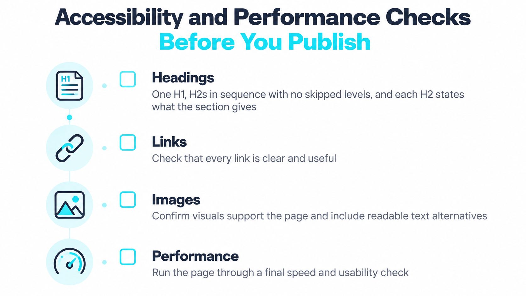
Headings: Use one H1, followed by H2s in order without skipping levels. Make each H2 clear about what its section covers.
Links: Write linked text that describes the destination. “FTC CAN-SPAM guidance” gives readers more context than “click here.”
Color: Make sure readers can understand information without color alone. Add a text label or icon when color signals meaning.
Tables: Include a clear header row. Check that the table remains understandable when a phone or screen reader presents it linearly.
Images: Write specific alt text for informative images. Leave alt text empty for decorative images so assistive technology can skip them.
Paragraphs: Keep each paragraph focused and comfortable to read on a phone.
Performance: Identify the largest visible element when the page loads. Google rates Largest Contentful Paint, or LCP, as good when that element renders within 2.5 seconds. LCP over 2.5 seconds and no more than 4 seconds needs improvement, while a result above 4 seconds is rated poor, according to Google's LCP guidance. Compress oversized hero images and check whether an image, video, or large text block delays the element.
Structured data: Make sure the page still answers the reader's question without a rich search appearance. Google's general structured data guidelines say correct markup does not guarantee that structured data will show up in search results. Markup does not replace useful content or a clear title.
A color contrast check is a practical part of theme review. Check whether text and meaning remain clear against the background, including for readers who have difficulty distinguishing colors. For a VeloCMS theme, review accessibility and color contrast as part of that check.
Finish by opening the published post on a phone and reading the first screen without scrolling. The answer should be visible right away.
Publish One Post in This Format This Week
The quickest way to make a template useful is to test it on a post that's already familiar. Choose one topic, draft the answer block and H2 outline, fill each section with information the reader needs, and finish with one next step. Publish the result within the week, then record how it performs over a defined period.
Compare that post with an earlier post of a different length rather than assuming one word count works for every topic. Track organic entrances, engaged time, scroll depth, sign-ups, and conversions. Those measures help show whether readers found the answer, continued through the page, and took the intended action. Update the post when its instructions or facts change.
A newsletter form needs its own clear promise and a working unsubscribe route. Tell subscribers what they'll receive, and make opting out straightforward. Under the U.S. CAN-SPAM Act, commercial email must use accurate header information, avoid deceptive subject lines, identify itself as an advertisement, and provide an opt-out mechanism. Senders must honor an opt-out request within 10 business days, and the mechanism must remain able to process requests for at least 30 days after the message is sent. The Federal Trade Commission says each separate email in violation of the Act is subject to penalties of up to $53,088, as set out in its CAN-SPAM compliance guide.
For a publisher who wants editing, SEO fields, and publishing in one place, VeloCMS uses a TipTap block-based editor with per-post Article JSON-LD, Open Graph, canonical URL, reading time, and tag filtering built in. It has no free plan, and every plan starts with a 14-day free trial; current options are listed on the VeloCMS pricing page.
Choose one existing post today and compare it with the template table. Rewrite its opening, give each H2 one job, and publish the improved version this week.
VeloCMS brings blogging, newsletters, memberships, and site theming into one subscription, with an editor built for structured posts and practical publishing workflows. Visit VeloCMS to see whether it fits the way your blog or small business site works.